ARC Analysis using Pandas
Jan 14, 2017
I’ve been intrigued about the idea of an Atlantic crossing by sailboat since I’ve lived in London. I used to race on friends boats back in Toronto for a number of years and I rather miss it in London. There are a few options to make the journey:
- ARC - Atlantic Rally for Cruisers
- Clipper Race - one design race with a mix of experienced and inexperienced crew.
- Crew on a boat delivery.
I’m very tempted to buy a boat because I want to sail more than a single passage to the Carribean. I’ve read that folks have done a trans-Atlantic in a range of boat sizes down to small boats which are less than 30’/9m. Not being satisified with merely sorting the data and counting I thought it would be a good opportunity to carry out some analysis on it. The two items that I thought would be helpful in picking a boat for trans-Atlantic voyages based on the available data are:
- Length Overall (LOA).
- Designer
Setup
I’ll assume you know how to install pandas, matplotlib, and Jupyter notebook, if not use this handy guide.
Having grown up close to big southern brother the USA, I unfortunately have a mixed mental model of imperial and metric for various dimensions. For boats it happens to be imperial so the first thing I’m going to do is import the data and scale it to the nearest foot with the following code:
1
2
3
4
5
6
7
8
9
10
11
# inlines graphs with Jupyter Notebook
%matplotlib inline
import pandas as pd
import matplotlib.pyplot as plt
plt.style.use('seaborn-pastel') # make it purdy
# load the data from a tab separated datafile using the first row as a header.
df = pd.read_csv('boats-2016.tsv', sep='\t', header=0)
# change the column headers
df.columns = ["Name", "Design", "LOA", "Owner", "Flag", "Route", "Division"]
# convert to and round to the nearest foot.
df['Rounded'] = (df['LOA'] * 3.28084).round(0)
Range
To sanity check the calculation I want to ensure the range is reasonable. I’m not expecting anything less than 20’ nor much greater than 100’.
1
2
3
4
5
6
7
8
9
10
11
df['Rounded'].describe()

count    288.000000
mean      50.315972
std       11.019186
min       31.000000
25%       43.000000
50%       49.000000
75%       55.000000
max      106.000000
Name: Rounded, dtype: float64
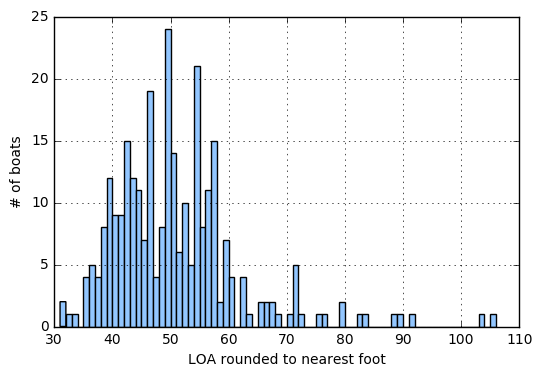
We’re only really interested in the min and max right now. 31’ and 106’ wow that guy has some deep pockets! Surely there’s not too many people with that length of boat which brings us to distribution.
Graphing Distribution
The most direct way to represent distribution in a plot is to use a histogram. One of the key considerations in using a histogram is binsize. Pandas will automatically select one for you or you can specify your own with the bins parameter. I decided since I already fudged the numbers a bit with my rounding it’d be better to see each foot discretely rather than letting matplotlib select a bin size. For this use-case I’ll make the bins equal to the difference between max and min which will be 1’ per bin as follows:
1
2
3
4
bins = int(df['Rounded'].max() - df['Rounded'].min())
ax = df['Rounded'].hist(bins=bins, figsize=(6,4))
ax.set_xlabel('LOA (feet)')
ax.set_ylabel('# of boats')

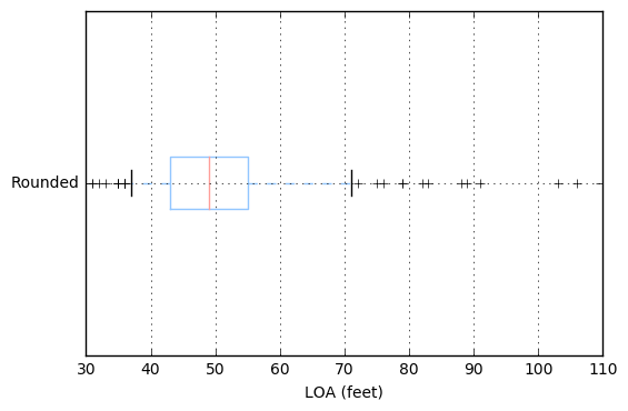
Another way to present this is a boxplot which demonstrates the distribution. The blue box indicates the 25th to 75th percentile and I’ll force the whiskers to draw at the 5th and 95th percentile as follows:
1
2
ax = df.boxplot(column=['Rounded'], whis=[5,95], figsize=(6,4), vert=False)
ax.set_xlabel('LOA (feet)')
Based on the plot below we can see that the majority of sailors participating in the ARC are between 43’ and 55’. With the median at 49’.

This isn’t really the best use of a boxplot. While it gives you the shape of the data, it doesn’t provide you with anything you couldn’t infer quickly from the histogram.
A boxplot’s strength is when comparing multiple buckets of data against one another. As an example if I wanted to answer the question; What do the lengths look like for the top 5 boat designers?
Designer
The first thing we need to do is identify the designer. Looking at the data it seems like I can use the first word of the Design field to get the designer. I’ll introduce a new column “Manufacturer” and look at the top 20 designers by number of participants as follows:
1
2
3
4
5
6
7
8
9
10
11
12
13
14
15
16
17
18
19
20
21
22
23
24
25
26
df['Manufacturer'] = df['Design'].str.split().str.get(0)
gbM = df.groupby(['Manufacturer'])['Manufacturer'].count().sort_values(ascending=False)
gbM.head(20)

Manufacturer
Beneteau      36
Oyster        26
Lagoon        20
Jeanneau      15
Bavaria       12
Hallberg       9
Moody          9
Hanse          9
Swan           7
Grand          6
Dufour         6
More           5
Amel           5
Catana         5
Elan           4
Alubat         4
Fountaine      4
Leopard        3
Baltic         3
Comfortina     3
Name: Manufacturer, dtype: int64
If we want to group by Manufacturer and LOA:
1
2
3
4
5
6
7
8
9
10
11
12
13
14
15
16
17
18
19
20
21
22
23
24
25
26
df['Manufacturer'] = df['Design'].str.split().str.get(0)
gbMR = df.groupby(['Manufacturer', 'Rounded'])['Manufacturer'].count().sort_values(ascending=False)
gbMR.head(20)

Manufacturer  Rounded
Beneteau      49.0       6
Lagoon        52.0       6
Beneteau      50.0       6
Oyster        57.0       6
                54.0       6
More          54.0       5
Beneteau      40.0       5
Jeanneau      54.0       4
Lagoon        46.0       4
Oyster        59.0       3
Discovery     56.0       3
Beneteau      39.0       3
                46.0       3
Jeanneau      42.0       3
Beneteau      55.0       3
Elan          44.0       3
Hallberg      42.0       3
Jeanneau      49.0       3
Lagoon        62.0       3
Hanse         56.0       3
Name: Manufacturer, dtype: int64
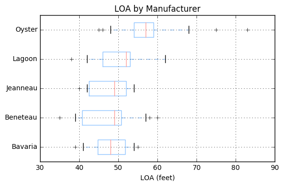
The most popular boats are Beneteau’s but in a variety of sizes. This is where the boxplot will shine. Let’s take the top 5 designers and put them into a new DataFrame.
1
2
top5 = gbM.to_frame().index.values[0:5]
dfM = df.set_index(['Manufacturer']).loc[top5,:]
Now let’s present the data in a boxplot.
1
2
3
4
ax = dfM.reset_index().boxplot(column=['Rounded'], by='Manufacturer', whis=[5,95], figsize=(6,4), vert=False)
ax.set_xlabel('LOA (feet)')
ax.set_title('LOA by Manufacturer')
plt.suptitle("") # remove the second title
Which results in the following graph:

From the above graph you can see that Oysters tend to be much larger boats in the ARC with a median close to 60’ and the 95th percentile near 70’. The other 4 designs are closer to 50’ and except for Lagoon are typically under 60’. You could of course use multiple histograms for this however it gives a clear view of what lengths are common across designs without too much noise.
I had a lot of fun thinking about ways to graph the data. One of the biggest takeaways is that when it comes to data there’s no single solution for representation. There’s tradeoffs and benefits between tables and various methods of graphing that depend on your audience and the message you’re trying to convey. In general if you want exact values a table is probably best. If you want a way to easily compare distributions by a particular grouping the boxplot works well. If you want to express magnitude within a distribution a histogram is generally your best tool. Any thoughts or comments let me know below!